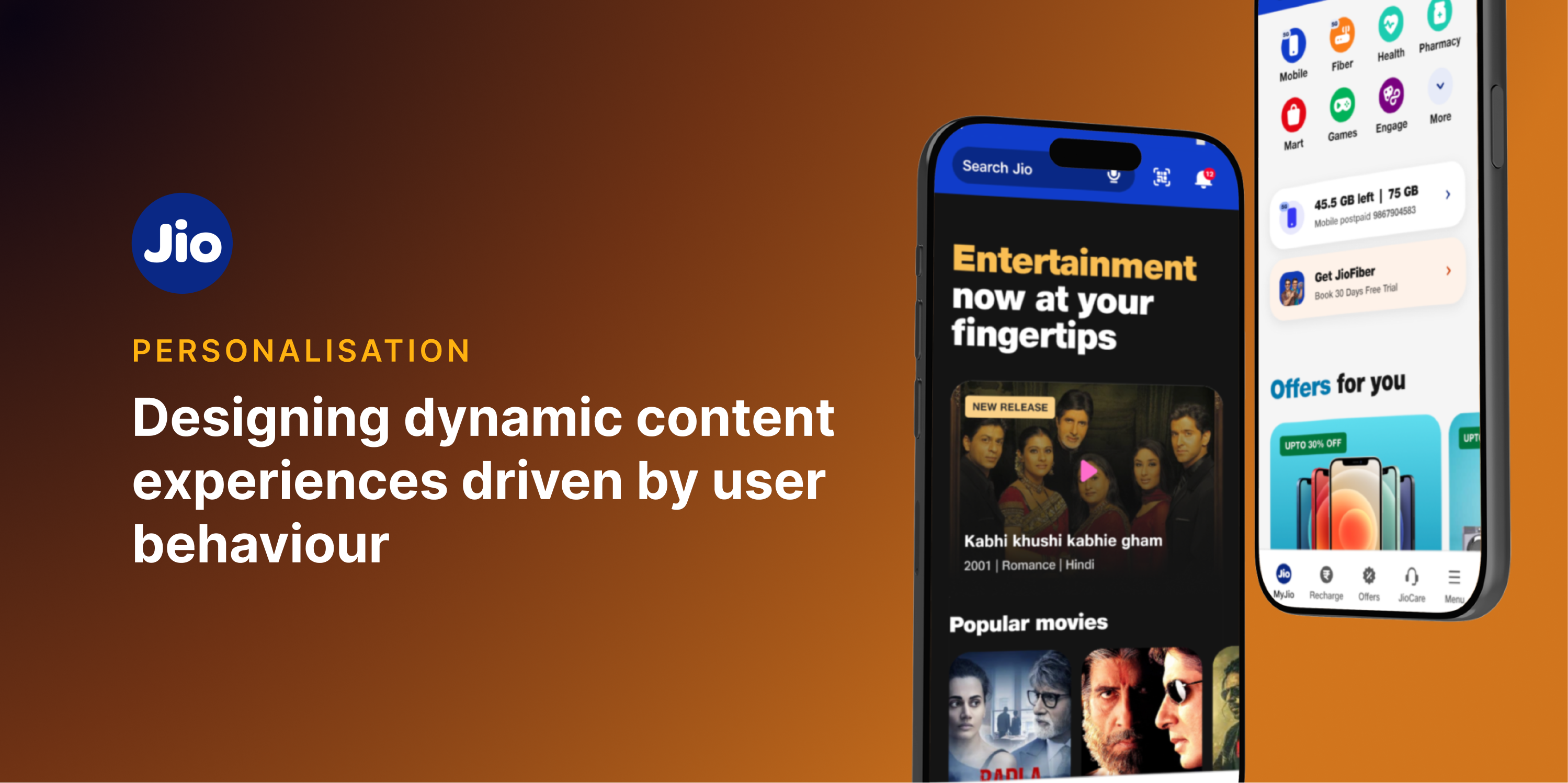
Case Study · MyJio · UI/UX Design
Making a super-app feel personal
Every user who opened MyJio came with one intent: recharge. Everything else—shopping, entertainment, health—existed. But it wasn't discovered. Not because it lacked value. Because it didn't feel relevant.
01 — The Problem
The home was static. The ecosystem wasn't experienced.
MyJio was built as a super-app—a single surface hosting JioTV, JioMart, health, games, and dozens of mini-apps. But most users treated it like a telecom utility. Open, recharge, close.
The problem wasn't missing features. It was perception. The home showed the same structure to everyone, regardless of who they were or what they needed.
“The ecosystem existed. But it wasn't experienced.”
Bridging into Phase 1
Solving the cold-start problem.
Personalisation relies on data.
New users have none.
This created a tradeoff:
- Ask for more information and increase setup effort.
- Ask for too little and reduce recommendation quality.
We identified three high-signal inputs that could improve relevance while keeping onboarding lightweight.
02 — Research
What leading apps do that MyJio didn't.
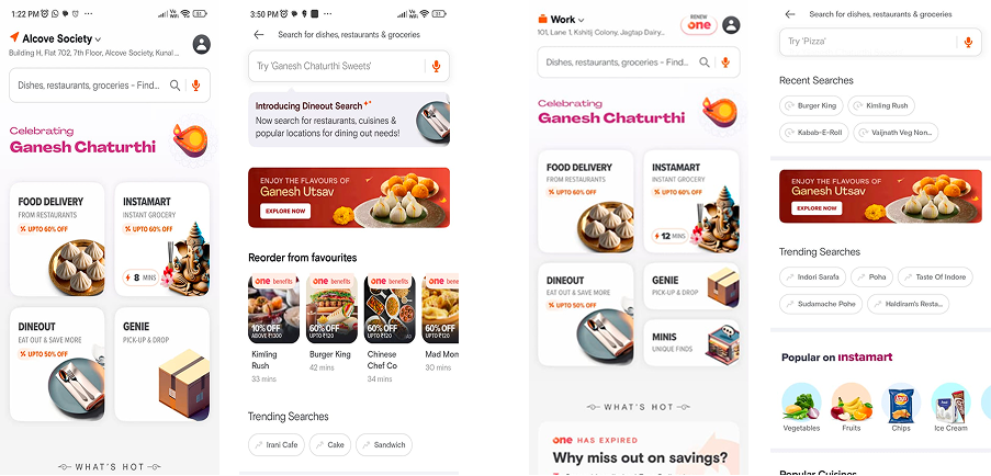
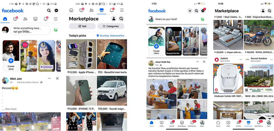
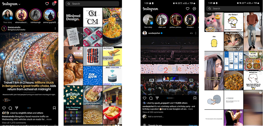
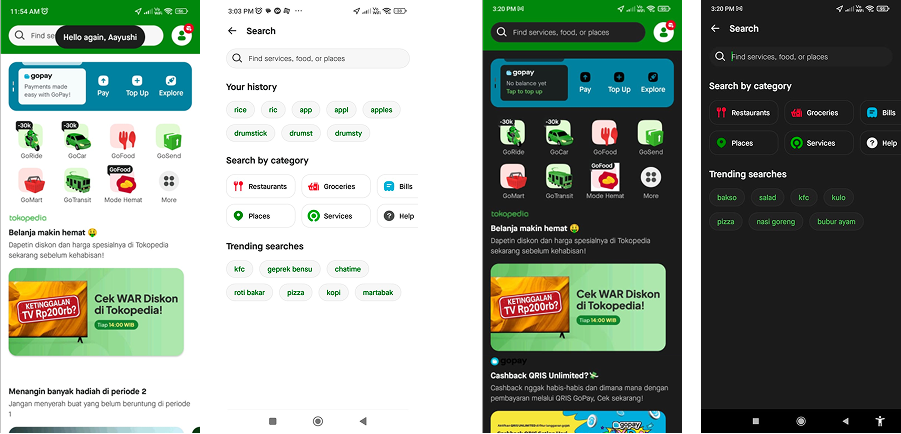
When we studied Swiggy, Gojek, Instagram, Facebook, and Amazon, one thing stood out: their home screens weren't fixed. They evolved—based on user behaviour, time of day, and intent.
Swiggy
Location-first onboarding. Time-of-day reordering. Contextual nudges from first session.
Friend & interest discovery during onboarding. The feed starts personalising from the very first session.
Feed and Explore adapt to viewing habits, trending topics, and recency. Continuous evolution.
Gojek
Dashboard density shifts on login depending on whether the user skews payment or mobility-focused.
The shift in thinking: personalisation isn't about showing more. It's about showing the right things, at the right time, with the least effort.
Making the app feel relevant before the user does anything.
The challenge was unique: you have no behavioural data on day one. So we designed for the first impression—capturing lightweight signals without ever feeling like a form.
Language
Preferred language seeds content + UI copy defaults
Location
Local offers, nearby plans, regional defaults
Interests
1–2 seeds: Movies, Shopping, Health, etc.
Tap one or more interests below — the rails you pick stack inside the MyJio home in the order you selected them. Scroll inside the phone to browse through.
Choose your interests
Tap multiple — the rails stack inside the phone in selection order. Scroll inside the phone to view all.
Letting the app evolve with every interaction.
Once users started interacting, the system needed to adapt. We combined declared preferences from onboarding with behavioural signals—clicks, dwell time, purchases—and contextual inputs like time of day and device.
One risk with personalisation: it becomes repetitive. We introduced expiry windows so content stayed fresh, not stale.
Promotional offers
24-hour expiry window · Rotates daily
Content rails
7-day window · Eligibility-based refresh
Relevance stayed high. Content didn't feel stale. Rotation logic + eligibility ensured users always saw something worth tapping.

User A Dashboard
Entertainment-forward: JioTV, Music, Games prominent

User B Dashboard
Commerce-forward: JioMart, Health, Pharmacy prominent
Same app · Same version · Different people — scroll inside each phone to explore
05 — Learnings
What this project changed in how I think.
01
Personalisation is about relevance, not volume. Showing less—but the right things—works better than surfacing everything.
02
Onboarding is about trust, not data collection. Show users what they get before you ask for anything.
03
Timing matters more than placement. The right content at the wrong moment is still irrelevant.
04
Systems need to adapt without overwhelming. Freshness windows and expiry logic keep the experience alive without noise.
“Personalisation works best when users feel understood—not observed.”