Case study · Tata Play · TPMA
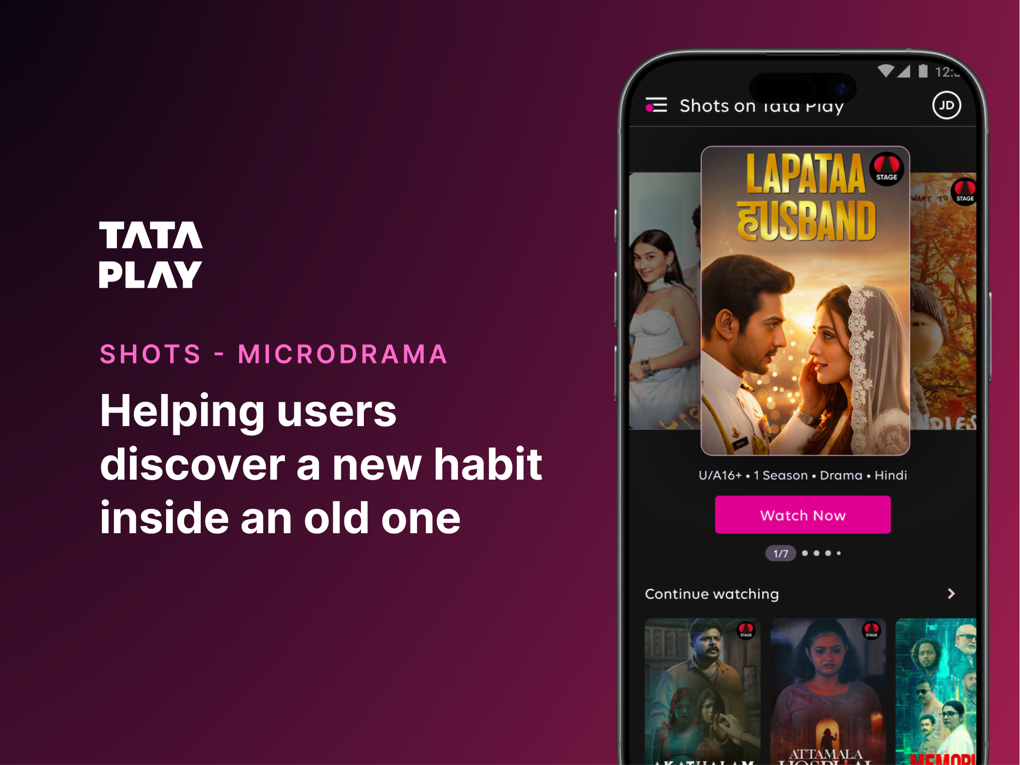
Shots: a new habit, inside an old one
Shots was Tata Play's entry into microdramas — short, vertically consumed, episodic stories built for mobile-first viewing. The format was completely new to the ecosystem. The challenge wasn't launching a feature. It was helping users discover, understand, and adopt a new viewing behaviour inside an app they already thought they understood.
Focus: Discovery · Merchandising · Player · Engagement
01 — The challenge
Users already knew what TPMA was for.
When people opened the Tata Play Mobile App, they came with a fixed set of intents.
Manage account
Recharge
Browse Live TV
That familiarity was the obstacle. Shots wasn't a new feature slotting into an established category — it was a new behaviour being introduced inside a mental model that had no room for it yet.
The real question
“How do you help users discover a new habit without disrupting the behaviours that already bring them to the app?”
02 — Competing priorities
Visibility was the obvious answer. It was also the wrong one.
Put Shots everywhere. Promote it aggressively. Drive traffic. Except homepage real estate was already one of the most contested surfaces in the product — and every existing surface was already earning its place.
Surfaces already pulling their weight
Account management
Content discovery
Subscriptions
Promotions
Partner offerings
Maximum visibility for Shots could easily come at the cost of existing journeys. This wasn't just a design problem — it was a prioritisation problem, and it needed Product, Content, and Business aligned before a single screen got drawn.
03 — A discovery framework
Three questions, not three placements.
To align stakeholders with different goals, discovery got framed around three principles instead of a list of surfaces.
Visibility
Can users notice it?
Relevance
Does it appear where it makes sense?
Disruption
Does it interrupt an existing task?
From
"Where can we place Shots?"
To
"Where can users discover Shots naturally?"
This shifted the conversation from promotion to experience design.
04 — Exploring discovery models
Three options. One clear winner.
Option 1
Dedicated Shots destination
Pros
- Clear ownership
- High visibility
Cons
- Relies on intentional discovery
- Requires learning a new destination
Option 2
Promotional-first
Pros
- Immediate exposure
- Easy to implement
Cons
- Risks banner blindness
- Feels promotional, not contextual
Option 3
PreferredDistributed discovery
Pros
- Lower friction
- Higher contextual relevance
- No new navigation behaviour
Cons
- Requires touchpoints across the app
Rather than one entry point, we designed a network of discovery opportunities — moments where users were already exploring content, where Shots could surface naturally instead of interrupting.
First-time modal on app open● auto
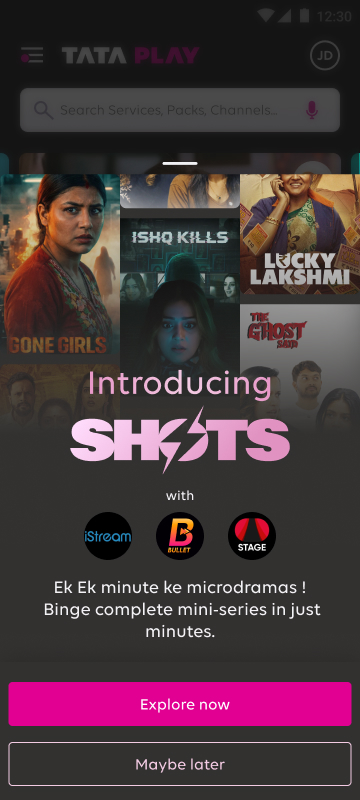
The user's only question
“Is this worth the next few minutes of my time?”
That's the only question a microdrama needs to answer fast. So the discovery surfaces leaned on visual storytelling, episodic cues, and concise metadata — reducing the decision to something almost instant.
05 — Where Shots actually lived
One page. A different opening line for everyone.
Every entry point we'd designed — the intro drawer, the shortcut, the bottom nav tab, the genre card, the homepage rail — led somewhere. That somewhere had to do two jobs at once: feel instantly orienting to someone who'd never seen a microdrama in their life, and feel like a returning ritual to someone three episodes deep into a story.
Rather than building two separate pages, we built one page that knows how to greet you differently. Most of it stays put. The greeting changes.
Design principle
“The page had to behave like it remembered you — without ever feeling like it had to be rebuilt for you.”
The page reads top to bottom like a conversation that gets gradually more specific. It opens wide — a hero carousel anyone would see, language filters anyone could use, a genre grid anyone could browse. By the time you've scrolled past the midpoint, it's narrowed in on what's trending near you, what the recommendation engine thinks you'd like, and a doorway into a fully filtered feed built around your taste.

What's worth noticing is the order. The page doesn't lead with personalisation — it earns its way there. By the time a viewer reaches the bottom three sections, they've already told the system something about themselves just by scrolling, filtering, or tapping a genre tile above. The recommendation engine isn't guessing cold; it's responding to a few seconds of real behaviour.
Why this mattered
Five of eight sections never change.
That wasn't a limitation of the build — it was the point. A page that personalises everything feels unpredictable. A page that personalises one sentence at the top, and a few rails near the bottom, feels like it's paying attention without ever feeling like a different product each time you open it.
06 — Solving continuity
Discovery solved half the problem. Then came the player.
Once a user opened a microdrama, a new behavioural problem appeared: how do you sustain attention across episodes that are each only a few minutes long?
Choose a title
Choose an episode
Return to listings
Choose again
Every decision point here is a chance to leave. For long-form content that's acceptable. For microdramas, it's costly.
- —Each episode is its own destination
- —Re-enter discovery after every episode
- —High navigation overhead
- →Continuous viewing experience
- →No repeated re-entry into discovery mode
- →Focus stays on content, not interface
Continuity insight
“Once users begin watching, they shouldn't have to repeatedly re-enter discovery mode.”
Full-bleed vertical player — swipe between episodes
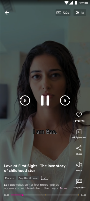
Continuous viewing can improve engagement — but pushed too far, it starts to feel automated rather than guided. The player needed to encourage progression while still preserving the sense that the user, not the app, was in control.
Encourage progression
momentum without forcing it
Maintain orientation
users always know where they are
Preserve autonomy
exit and control stay one tap away
07 — Designed for fragments of time
Microdramas live in spare minutes.
This kind of content gets consumed while commuting, waiting, multitasking — in the gaps of a day, not a dedicated sitting. Every interaction was evaluated against that reality.
Commuting
Waiting
Multitasking
Filling spare minutes
Optimised for quick entry, immediate understanding, effortless continuation, and easy exit — four tests every interaction had to pass.

Full-bleed vertical player
Swipe interaction, like/share/episodes rail
Playback controls
Play, pause, skip — minimal and familiar
Ad placement in-player
Partner offer unit between episodes
08 — Outcome
From intentional search to natural discovery.
Instead of requiring users to actively seek out a new content category, the experience let discovery happen through journeys they were already on.
Discovery
Curiosity
Viewing
Continued engagement
No new behaviour had to be learned upfront — it emerged from familiar ones.
01
New features succeed when they fit into existing behaviours, not when they ask users to form new ones first.
02
Visibility alone doesn't create adoption. Relevance and timing do the real work.
03
Every extra decision point is a drop-off risk — for short-form content, this cost compounds fast.
04
Discovery and consumption are one connected system, not two separate design problems.
09 — What I'd explore next
Where this could go from here.
A network of discovery surfaces and a continuity-first player created the foundation. The next set of moves would push the system from reactive to anticipatory.
Personalised recommendations
Surface titles based on watch history, language, and time-of-day signals.
Behaviour-based entry optimisation
Promote the entry point most likely to convert for that user, on that day.
Cross-platform continuation
Pick up an episode on the TPMA mobile app where you left off on the connected TV.
Predictive sequencing
Stitch episodes from different titles into a personalised, never-ending micro-stream.
“Users rarely adopt a feature because it exists. They adopt it when it fits naturally into how they already behave. Successful product experiences don't just deliver content — they reshape behaviour.”