Case study · Tata Play · Specials
Giving curated content packs a place to be discovered
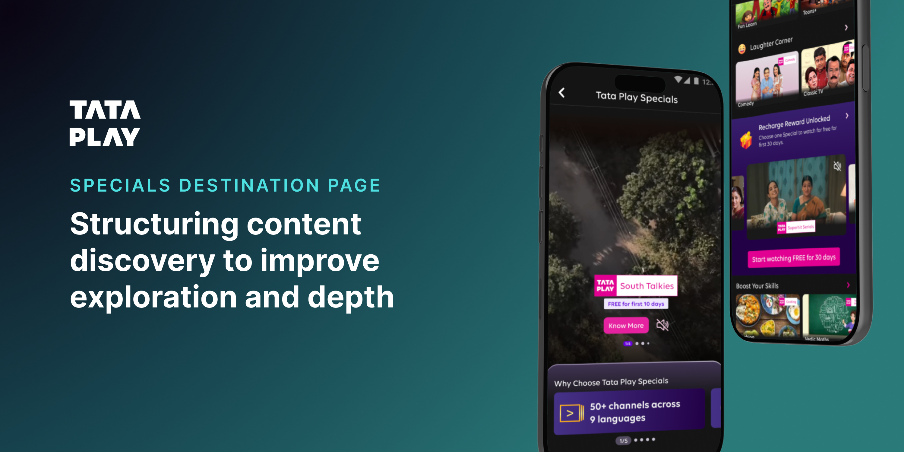
Tata Play Specials had real value — curated content packs available to buy across the app. What it never had was a home. Specials lived buried inside other journeys, easy to miss and easier to forget. There was no dedicated destination for it. I designed one from scratch.
Focus: Content design · Discovery · Modular widgets
01 — Where Specials actually lived
Buried, not broken. Just never given a home.
Before this project, there was no Specials destination page at all. The packs existed and people did buy them — but only when they happened to run into a banner, a stray carousel card, or a promo tucked inside an unrelated journey in TPMA. Nobody opened the app looking for Specials, because there was never anywhere to go looking.
Before
Specials scattered across banners, promos, and one-off carousels inside other journeys.
What I built
A dedicated destination page, designed from scratch, purpose-built for discovery.
Once the destination existed as a concept, the actual problem came into focus. It wasn't that the content lacked value — it was missing the three things any new destination needs: a clear entry point, a reason to explore once you arrived, and momentum to keep going.
When discovery feels like effort, people don't push through it. They fall back to what they already know — for most users, that meant Specials simply never entered the picture.
Wrong question
“How do we show more content?”
Right question
“How do we make exploring feel effortless — maybe even fun?”
02 — Reframing the page
Not a catalogue. A discovery surface.
A traditional catalogue would have been the safe answer — organise everything, let people scroll, done. But catalogues are built to organise content, not to spark curiosity. With no existing destination to anchor against, I had a genuinely blank canvas, and two very different ways to fill it.
Approach A
Specials-first
Treat Specials as the product itself. Lead with category structure, surface subscription value upfront, and design the whole page around driving the purchase decision directly.
Approach B
Content-first
Let people start with what they already want — shows, movies, previews — and let the fact that it's a Special reveal itself organically as they browse, rather than leading with the business label.
What this exercise clarified: people don't care about “Specials” as a category. They care about what looks interesting, what feels relevant right now, and what's easy enough to just try. That pointed toward content-first as the stronger foundation — but the final destination still needed Specials-first moments layered in, particularly anywhere a purchase decision needed to happen.
03 — Designing for interaction, not navigation
Stop stacking rails. Start designing moments.
This is where the destination actually took shape. Instead of adding another row of tiles, I introduced a handful of components built around doing something, not just looking at something. Below are three of those moments — the full motion versions live as prototypes linked below.
Widget 01
Special Bytes
Story-style previews that ask nothing of you upfront. Tap one and you get a few seconds of a show before committing to anything — the same low-effort, high-curiosity shape as a social story.
Widget 02
Recommendation of the Week
A shake reveals it, not a tap — breaking passive scrolling on purpose with a small bit of physical surprise instead of another button.
Widget 03
“What’s your vibe?” quiz
For people who don't know what they want, two quick taps replace an empty search box — removing decision fatigue while still feeling personal, not heavy.
This case study can't hold video, so the originals — built with motion and GIF-led headers — live as real prototypes instead. Tap below to see the actual designs.
04 — The genre page
One more layer, for the still-undecided.
Tapping any genre tab in the genre rail on the destination page opens a dedicated genre page — not just a filtered version of the same rail. The genre you tapped arrives pre-selected in the filter, and a language filter sits alongside it, so the narrowing carries through instead of resetting.
05 — The last stop on the page
For the people who scroll all the way down. Still undecided.
Playful moments solve “I don't want to browse.” They don't solve “I genuinely don't know what to watch.” That second problem needed something deliberately placed at the very end of the destination page — a last, structured attempt to help, for anyone who'd made it all the way down without finding something.
Step 1
Pick a genre or category
Step 2
Cards surface, with language filter on top
What this section solves
“Helping users go from ‘I don't know what to watch’ to ‘this looks right’ in a few steps.”
Tap the screen to advance
Placing this at the bottom rather than the top was deliberate. Everything above it is built to spark curiosity without asking for a decision. This is the one place on the page that finally asks for one — placed only after every lighter, lower-effort option had already had its chance.
06 — Designing for scale, not just this page
Every widget was built to outlive this one destination.
None of these components were one-off decorations. Each was built as a modular piece that could be reused elsewhere in the app, not stitched together as a single bespoke page.
Reusable across the app
Adaptable to other contexts
Faster to iterate on
And unlike a typical web redesign, this wasn't about hover states or page transitions. The whole project leaned on real interaction patterns — with motion supporting the interaction, never replacing it.
Get a Special
Swipe-to-reveal interaction
Recharge reward unlocked
Tab switch changes the video preview below
Recommendation of the week
Shake-to-reveal interaction
The shift wasn't just visual. People went from passively scrolling to actively tapping, exploring, and discovering — the page stopped being something you scrolled past and became something you did something with.
01
Discovery needs momentum, not just structure. A well-organised page can still feel like effort.
02
Interactions reduce friction when designed with intent— not as decoration on top of a list.
03
People engage more when they feel in control of how they arrive at a decision.
04
Playfulness, done right, increases exploration — it doesn't distract from it.
Reflection
This project pushed me out of structured design thinking. There were no benchmarks, no established patterns to lean on — which meant working from first principles. It reinforced something simple: people don't explore because content exists. They explore because it feels worth their time.
“People don't explore because content exists. They explore because it feels worth their time.”